
New Life in our Logo

Have you noticed something a little different about our logo lately? To celebrate Grassroots Ecology's 10th anniversary, we created a special edition logo for this year only—one that showcases something both beautiful and central to our work: California native plants.
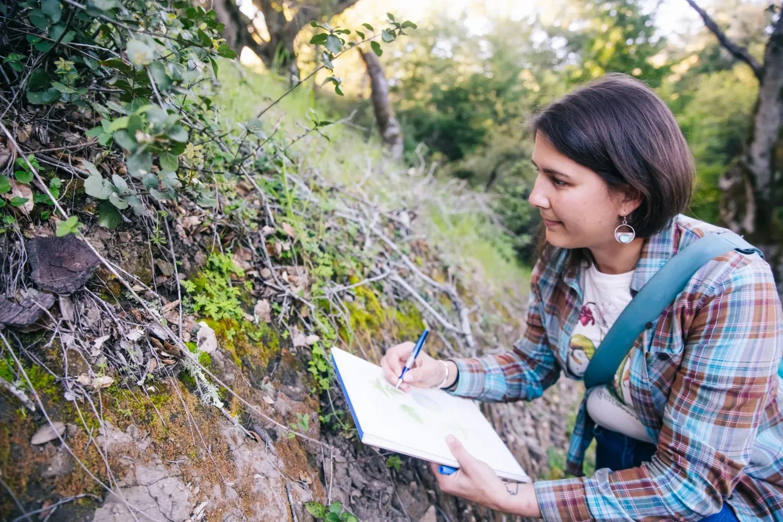
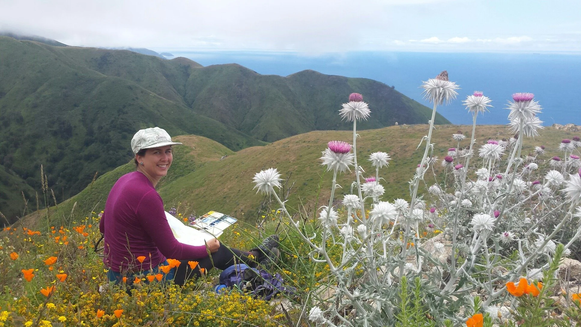
First, we had to find an illustrator to help bring it to life—someone who shared our love of California’s ecology. While we have many talented artists among our staff and interns, they were more than busy enough in the field. So we cast the net further. Ultimately our search led us to Andrea Dingeldein (pictured), an illustrator, naturalist, and science communicator based in the Santa Cruz Mountains. As someone with a love and understanding of both science and nature, she was the perfect person for the job. Read more about Andrea in the “About the Artist” section below.
Now that we had found an illustrator, the next question was: which plants did we want to include? We decided on incorporating 10 plants, for 10 years. This step was simultaneously the most fun and the most challenging. We love so many plants, how could we ever narrow it down?!
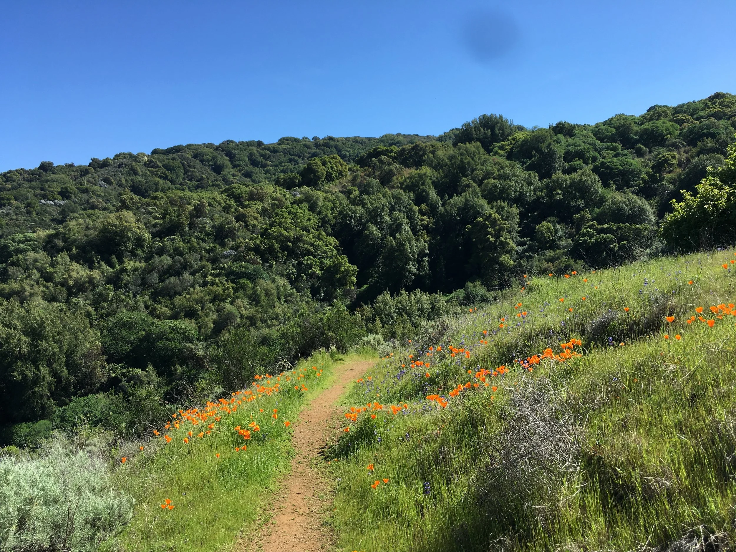
California poppy, Eschscholzia californica, and sky lupine, Lupinus nanus
To begin, we chose some of the icons of local biodiversity: the poppies and lupines that color our hillsides (pictured), the lilies and mule’s ear sunflowers that surprise us on the trails, or the clarkia that keeps our spring color going well into the summer. When we think of Bay Area wildflowers, these are surely among the first that come to mind.

Next, we added plant species that, while perhaps less showy or iconic, are key species we grow and use in habitat restoration. This included sneezeweed, which provides countless seeds to wildlife, spreads rapidly, and creates a colorful flower while doing so. We also chose blue witch nightshade, a hardy plant that can thrive in heat and along steep slopes—helping transform degraded habitat sites into homes for wildlife.
Soaproot (pictured) also made the cut, a unique favorite with a large variety of uses (soap being one of them!), but also because they spread lots of seeds and are significant to many people. If you look for their lily-like flowers, you’ll need to time it just right. They only open in the evening, and are often closed before you wake up the next morning.
Soaproot, Chlorogalum pomeridianum
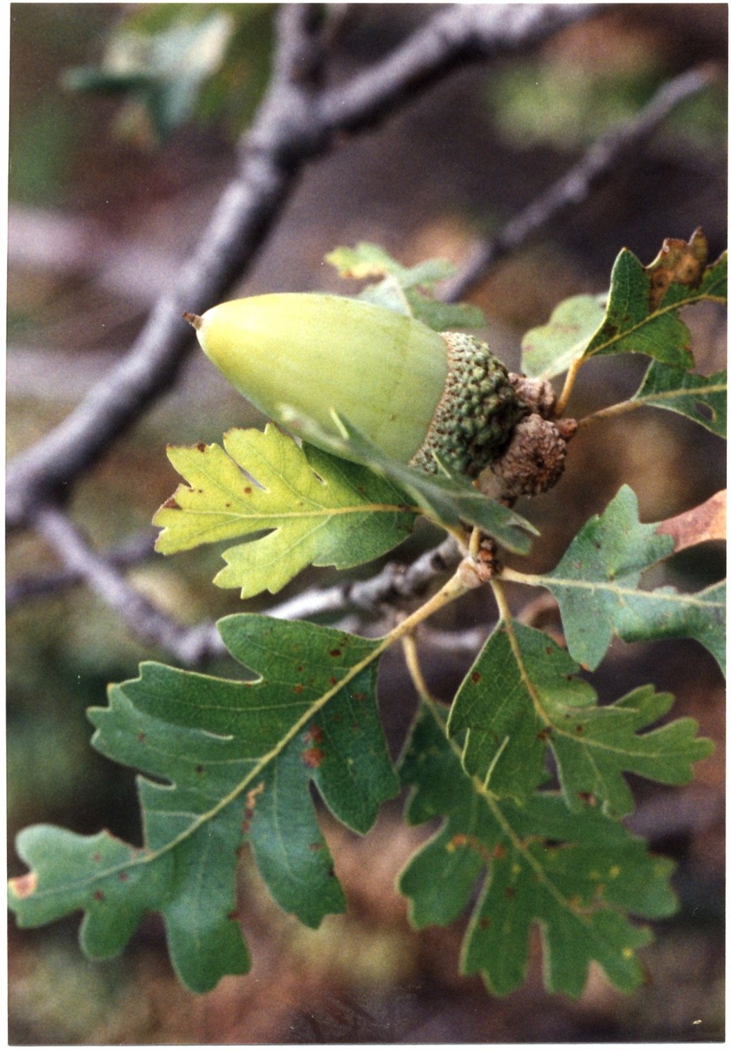
For the final plant, we decided to include a tree. While many folks fall in love with plants through wildflowers, many others do through trees. What tree could be more significant to us than the oaks? Oaks are vital to ecosystems, the people who have always lived here, and to the next generations who will continue to love and steward them as they grow. We decided on valley oak for the logo (represented as a leaf and acorn, pictured), partly because of its beautiful sinuous shape, as shown by the enormous valley oaks that grow along the road to our native plant nursery.
After selecting our 10 plants, Andrea set out to work to weave them into a cohesive logo, a sort of digital wreath (pictured). Part of her process was to get to know these plants, either from past experience or to seek them out in the wild. She observed and sketched some of the plants in the field, which inspired their appearance on the design. We love it so much we are taking every opportunity to use it, all year long.

Valley oak, Quercus lobata
So, which plant in our logo do you like most? If I had to pick a favorite (I could never), it would probably be the lupines because they were the wildflowers that made me fall in love with native plants. As for Andrea, our illustrator, her favorite is the checker lily:
“I love the way checker lily flowers gracefully bend towards the ground, and I visit a preserve near my house in the Santa Cruz Mountains every spring to see them bloom!
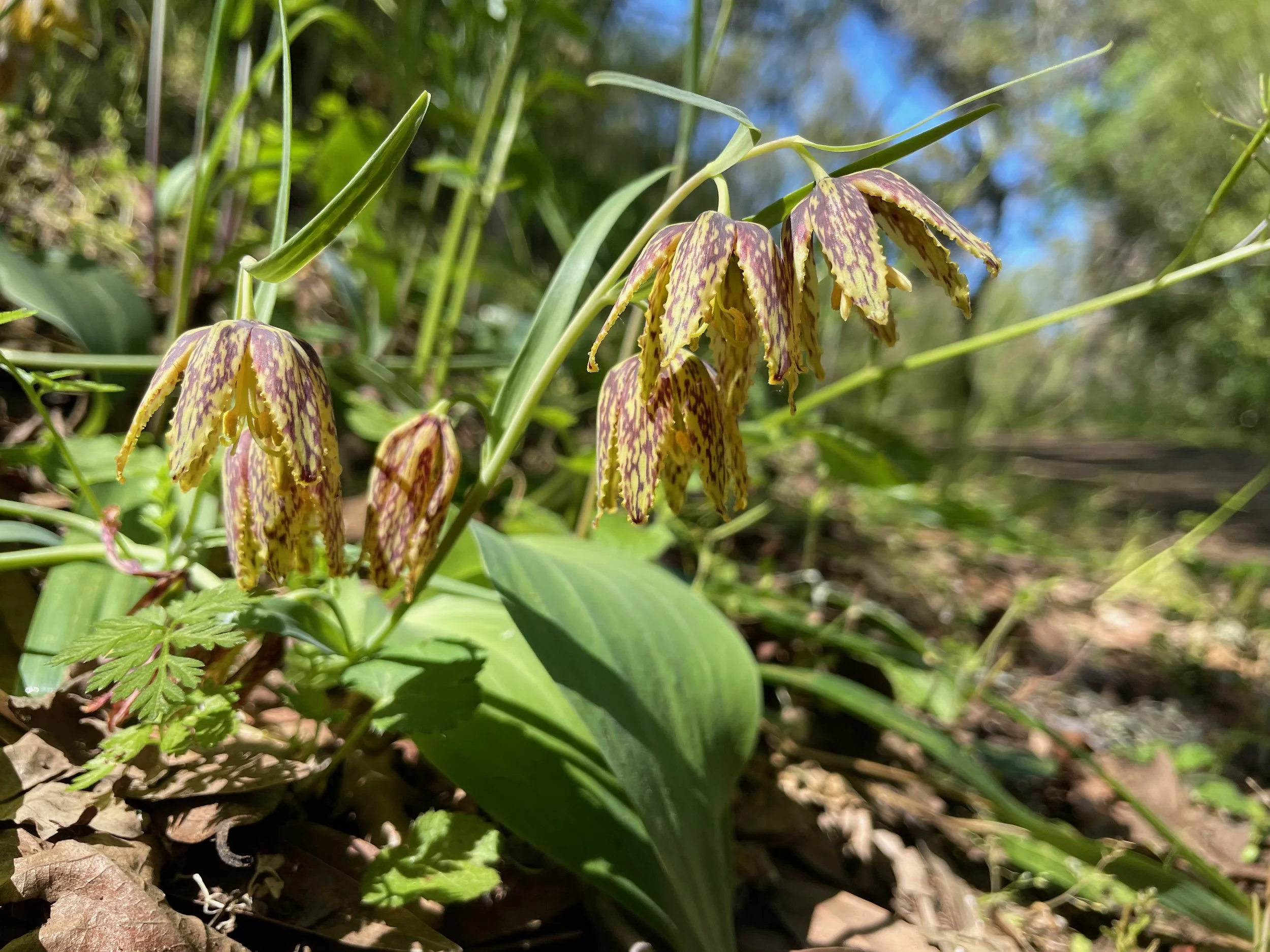
Checker lily, Fritillaria affinis
I also noticed a blue witch nightshade for the first time on a walk a week after I finished, which just goes to show how illustrating a species can raise personal awareness and appreciation for it.”

Blue witch, Solanum umbelliferum
But you don’t have to pick a favorite; each plant is special, and all of them are better together. Combined, they represent the landscapes we've restored together, and the shared commitment that continues to sustain them. As we look ahead to our next decade, they serve as a reminder of both how far we've come and what we're still growing.
About the Artist
What first got you interested in science illustration?
I studied both science and art in undergrad and have always been unable to choose one or the other as a career path... so I chose both! While working on my Master’s Degree in Marine Biology, I was asked over and over by peers to draw figures for their research publications. I discovered that I had a niche skill set that could keep me involved in science while also feeding my need to create art.
What do you like about illustrating the natural world?
Our special edition logo was designed by Andrea Dingeldein, an illustrator, naturalist, and science communicator based in the Santa Cruz Mountains.
There are so many reasons I like illustrating plants and animals: the beautiful colors and textures, the diversity of form, the joy that I get from the process of drawing and painting. The best part is observing these amazing organisms in the wild, learning more about them, and knowing that my artwork is helping to inspire the public to protect and preserve nature.
More of Andrea Dingeldein’s work can be found at thelocalnaturalist.com or on Instagram at @the_local_naturalist.
By Tyler Feld (he/him), Co-Executive Director
